Typography as Art: Choosing the Right Font for Impact
 2024-04-25
 189 Comments
Typography as Art: Choosing the Right Font for Impact
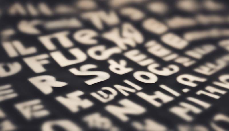
Typography is often considered the art of arranging text in a visually appealing and legible manner. The right font can elevate the aesthetics of any design, from a simple business card to a sophisticated website. It can set the tone, convey emotion, and even influence the viewer's perception of the message. In this article, we will explore the importance of typography in design and how to choose the right font for maximum impact.
The Role of Typography in Design
Typography is a fundamental aspect of visual communication. It's not just about the words themselves, but how they look, their arrangement, and the overall impact they have on the viewer. Here are some of the key roles that typography plays in design:
- Aesthetic Appeal: Beautiful typography can make a design more attractive and engaging.
- Readability: The right font can make text easier to read and understand.
- Emotional Response: Different fonts can elicit different emotional responses from the audience.
- Branding: Typography can help reinforce a brand's identity and make it more memorable.
- Hierarchical Structure: It can guide the viewer's eye through the content in a logical order.
Understanding Font Characteristics
Before you can choose the right font for your design, it's important to understand the various characteristics that define a font. These include:
Advertisement
- Serifs: The small lines or strokes attached to the ends of a letter.
- Sans-serif: Fonts without the small lines (serifs).
- Weight: The thickness of the strokes that make up the letters.
- Width: How condensed or expanded the characters are.
- X-height: The height of the lowercase 'x' in the font, which can affect readability.
- Spacing: The space between characters and lines of text.
Choosing the Right Font
When it comes to choosing the right font for your design, there are several factors to consider:
1. Purpose of the Design
Consider the purpose of your design. Is it for a formal invitation, a casual flyer, a corporate report, or a fun advertisement? The right font can help communicate the intended message more effectively.
2. Target Audience
Understanding your target audience is crucial. Different age groups and demographics may respond differently to various fonts. For example, a font that appeals to teenagers might not be suitable for an elderly audience.
3. Emotional Impact
Fonts can convey a range of emotions. Serif fonts are often seen as more traditional and classic, while sans-serif fonts can appear more modern and clean. Script fonts can be romantic or formal, depending on their style.
4. Compatibility with Other Design Elements
Choose a font that complements the other design elements, such as images, colors, and layout. The font should enhance the overall design, not distract from it.
5. Readability and Legibility
While it's important to choose a font that is visually appealing, it's equally important to ensure that it is easy to read and understand. This is especially crucial for body text in designs such as books, magazines, and websites.
6. Licensing and Availability
Make sure you have the right to use the font in your design, especially if it's for commercial purposes. Some fonts require a license, while others are free for personal use only.
Common Font Combinations
When using multiple fonts in a design, it's important to choose fonts that work well together. Here are some common combinations:
- Serif and Sans-serif: A classic combination that provides contrast and visual interest.
- Two Sans-serif Fonts: Different weights and styles of sans-serif fonts can work well together, especially for a clean, modern look.
- Script and Sans-serif: A script font for headings and a sans-serif font for body text can create a sophisticated and elegant design.
Experimenting with Typography
While it's important to follow best practices when it comes to typography, don't be afraid to experiment and push the boundaries. Try different font combinations, sizes, and styles to see what works best for your design. Remember, typography is an art, and there's no one-size-fits-all solution.
Conclusion
Typography is a powerful tool in design, and choosing the right font can make all the difference. By considering the purpose of your design, your target audience, the emotional impact, compatibility with other design elements, readability, and licensing, you can select the perfect font to enhance your design and create a lasting impact on your audience.